In our age of overconsumption and overstimulation, we need to talk about how the different aspects of our designs relate to human behavior. Carl Jung stated that “colors are the mother tongue of the subconscious” — tying colors directly to familiar deceptive design patterns driven purely by commercial agendas.
In our research on color, we wish to go beyond color as a commercial tool to alter behavior. Instead, we look at its relation to our health and our power of judgement. By doing this, we take part in a long tradition of aesthetic valuation that has largely been forgotten: Long before color psychology was a field of study, color was being used as a method of treatment. The ancient Egyptians developed color cures, using painted rooms and light shining through crystals as therapy. One of the earliest medical documents, the Nei Ching, documents color diagnoses associated with color healing practices.
Color psychology is not an exact science, and our perception of color is also individually formed by experience, context, and culture. Nevertheless, the many indications of a strong component of biologically adopted color preference should serve as an imperative for designers wishing to shape a better and more beautiful future. We are only starting to understand the effect that color have on our health, but as the body of research on biophilic design and neuroaesthetics continues to grow, the connections between color, nature, beauty, and wellness are becoming clearer.
Table of contents:
• Introduction
• Part I — Natural light
• Part II — Imagery of nature
• Part III — Natural colors
• Part IIII — Shapes in nature (coming)
• Part IIIII — Spatial concepts (coming)
Also worth reading: Do we appreciate humanity’s deeper aesthetic needs?
Part III. A connection with nature through a natural distribution of colors
“Why are colors available to us humans in this world?” This, cited from the Swedish physicist Pehr Sällström, could serve as a beginning stage for an investigation into the rich and stimulating occurrence of colors in nature.
Is a yellow flower yellow? Or is the yellow inside of us? Color presents an everlasting challenge to anyone wanting to understand it. Somehow separated from the objects they present, colors can only be perceived. Seemingly disconnected from mechanics, you could almost say colors are illusions — products of our sensory organs. No wonder colors remain a challenging aspect of any aesthetic discussion. Colors are truly “in the eye of the beholder”.
Still, colors belong to the physical realm. As a property of the object, we perceive the flower as yellow because of how it is composed to absorb and reflect light. A complex and nuanced understanding of an object’s properties through colors makes it possible for us to recognize, understand and orient ourselves in our surroundings. To us, colors are information following patterns and context, helping us navigate, sort, and distinguish.
3.1. Stimulation through colors
Colors are present wherever the eye can see. This might be why they’re the single most influential factor of both under- and over-stimulating environments. They have the power to change breathing patterns, heartbeat rate, and blood pressure. To make us brittle, and anxious, and even cause physiological health issues. But even more important — to calm, and joy.
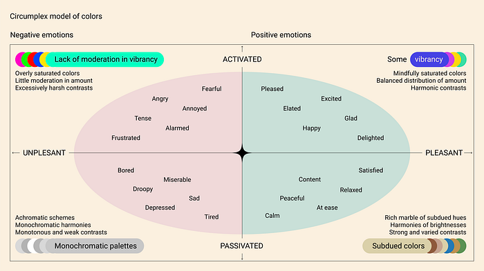
3.1.1. Pleasant and unpleasant activation and deactivation through colors. On one hand, a lack of colors can cause boredom, sadness and depression. On the other, a lack of moderation can trigger agitation and exaggerated body activation, leading to anxiety and fear. Both under- and over-stimulation can lead to judgement issues and challenges in focus, and at times, more amazing responses.
But a mindful approach to color use can produce positive mind-body effects. They can calm us, make us peaceful, and ground us. Or excite, delight, and please us. It should be understood, though, that both monochromatic and overly vivid color palettes can be quite pleasing if the totality of the experience in other ways manages to pleasantly balance the overall stimulation. Still, the circumplex model below can be used as a simple and effective guide to a balanced use of color.

3.1.2. Subdued colors as ambiance — to calm and strengthen judgment. As the circumplex model suggests, environments that elicit high levels of pleasure with low levels of activation are most likely to induce a state of calm (lower right portion). We find exactly this combination in grown habitats, where we’re exposed to an overweight of subdued colors.
These colors, often diverse variations of greens, blues, and browns, are the colors of the ambiance. They’re the colors of everything in nature that needs to be present, but doesn’t call upon our immediate attention. In painting the backdrop of the scene we navigate in, the unimposing presence of these environmental colors are vital. They form the basis of atmospheres in which we feel present, calm, and focused.
Following this argument, people could benefit of designed environments consisting mostly of subdued nature tones. This could help us feel at ease, and support rational consumer behavior. In order to feel alive, subdued environments need a careful arrangement of interesting features. Variations in hue and brightness, a sense of natural light and shadow, non-rhythmic motion, natural scents and sounds, and sparks of vivid colors that shine through, can fill a subdued and calming environment with a sense of drama and energy.

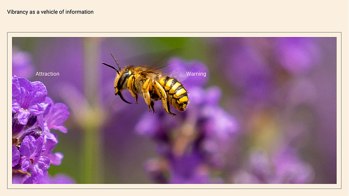
3.1.3. Saturated colors: Vibrancy as a vehicle of information. Our attraction to vivid colors may lead to another question about the yellow flower: Why did we evolve to be attracted to flowers? The answer can be found in understanding what colors represent to us in nature. Strong colors in plants and animals signal fitness and vitality, and our ability to locate resources and identify danger has been closely tied to the distribution of vibrant colors in nature. Flowers, with their vibrancy, have been an important indicator throughout human evolution of our most important resource; Food.
Often representing either danger (aposematism) or reward, natural objects of strong colors speak loudly to us because they carry important messages. This suggests the use of vibrant colors as transmitters of vital information, attracting the eye to what is of importance. And whether to warn or attract, our bodies react to vivid colors by activation. Acknowledging this can help us to understand how to balance subdued and vibrant colors in a palette, to strike a healthy balance of activating and calming qualities.

3.1.4. Cold and warm hues. Above, we discussed subdued environmental colors, whose role is to be present, without asking for attention. Consequently, cold hues — blue, often found in the sky and the ocean, and greens and browns, found in the grown habitat—are associated with feelings of relaxation and calmness. Hence, these colors are proposed to facilitate focus and enhance performance on tasks requiring sustained attention.
On the other hand, warm colors—red, orange, and yellow—are often associated with strong feelings such as passion, excitement, and warmth. They are the colors of fire. Of the sun. Of warmth and energy. Studies show that warm colors increase arousal. Adrenaline starts to flow, blood pressure increases and temperature is perceived to be warmer. The color red has a special place in our minds and is often associated with strong emotions such as aggression and passion. This ties well into our sensitivity to blood: From a bleeding wound to a blushing face—we react to and notice even the smallest variations of red.
This can help us understand how to design calm spaces with a balanced amount of bodily activation. It should be understood, though, that saturation and brightness are possibly of higher importance than hue. Interestingly, most research on color psychology does not include these two fundamental components of a color.

3.2. Adapting natural colors to situation
By dynamically adjusting our colors according to the position of the sun at a person’s given location, we might enable a better circadian rhythm and a more natural flow throughout the day.
3.2.1. Dynamic seasonal colors. We have previously discussed how we can use the knowledge of light to ground people in time. Equally, to help tie people to their physical location, we could equip our designs with seasonal shifts in color. This could help us align our bodies with the shifts in nature. From a colorful summer palette bringing growth and life, to a subdued winter palette regulating our body in line with the resting nature. Surrounding ourselves in quiet environments to slow down our routines during the winter months could help us recharge and re-center for warmer times.
On the other hand, humans might not be fully emotionally equipped to live in locations with dimly lit seasons, and could very well need the opposite of a dark screen in the winter. All over the planet, humans point towards the same scene when picturing beauty: The savanna — green and amber grasslands with widely spaced, laterally spreading trees. Open vistas of blue skies, animals grazing in the distance, and a source of water nearby. This proposes that we’re still biologically programmed to thrive at such locations. As the ancient Egyptians used painted rooms or sunlight shining through crystals as therapy, maybe we during the cold and dark winter months could need “color cures”?

3.2.2. Employing twilight blue and flame light for dynamic night mode. Melatonin is a hormone that helps regulate our sleep-wake cycles. The production of it is influenced by exposure to light, and studies propose that blue light, in particular, can suppress the production of melatonin. Blue light has a shorter wavelength and higher energy than other colors of light, and is said to be more effective at stimulating the photoreceptors in the eye that affect the body’s internal clock. As a result, exposure to blue light at night is believed to disrupt the body’s natural sleep-wake cycle and make it more difficult to fall asleep. These studies are currently guiding many design decisions, such as digital device “night modes” which add a warm yellow hue to screens in the evening.
But can it really be that blue — the color of the night— makes it harder to sleep? Some studies suggest that our understanding of blue light might be misguided. The blue colors could even have a weaker effect than the white or yellow light of equivalent brightness. And brightness might be the most important factor here. The energizing midday sunlight, often slightly yellow, is extremely bright. The blue twilight and moonlight, on the other hand, are very dim. In other words: We are awake in the bright, yellow day, and we sleep in the dim, blue night.
Still, it is pleasing to surround ourselves with some warm light in the evening. Reminding us of a force of nature we tamed early, the quiet, contemplative atmosphere of a flickering flame is both calming and mesmerizing. Its warmth relaxes, and it encourages introspection and reflection.
This could inform the design of healthy environments. Leaning further into natural aesthetics, a better approach to “night mode” could be to design passive dim blue ambient environments, eventually lit in burning orange when interacted with. This approach, operating between two states, could be extra interesting for always-on-displays, and especially impactful for ambient computing, with far-field and near-field interaction.

Contact:
Design Ethics Director
Stein Haugen
stein [a] heydays.no
